Skip to content

PANTONE's color of the year is called Veri Peri. A Veri Per Pallet is a guide to use the unique color to deign a splendid house
Creative ways to incorporate pantones 2022 color of the year in your home.
A tradition that has stood the tests of time for more than two decades, Pantone's color of the year sets the tone for design trends across all fields at the start of every year. Also for the first time in Pantone’s history, a color was created fresh and not chosen from Pantones existing palette. This was done to celebrate humanity’s collective step into the future.

PANTONE 17-3938 - Very Peri is the color of the year. In addition to its blend of blue-violet and periwrinkle. Veri peri displays carefree confidence and a daring curiosity. In conclusion, it's a splendid hue to guide your home’s décor and design plans.
Here’s how you can incorporate this stunning color into your homes design:
1. Balance Warms & Cools
The cool blue undertones of charming veri peri are perfectly complementary to warm-neutral hues. Thus making this color versatile and the perfect canvas for any design plan. You can adjust the brightness of this shade and add contrasting hues to create a design that is dynamic, in styles like mid-century modern, contemporary, or bohemian.

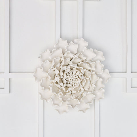
Furthermore block-color decor, peri pastel ceramics, or veri peri wall art are ways to incorporate this color into your design.
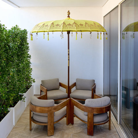
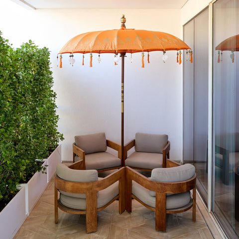
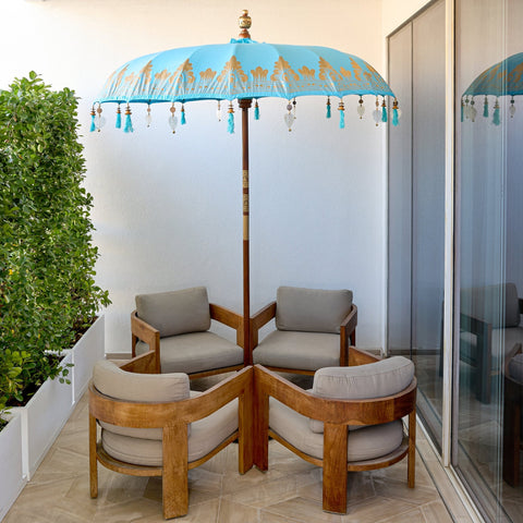
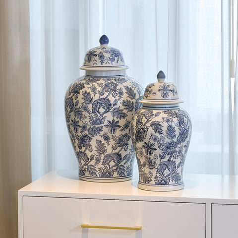
2. Veri Peri Accents

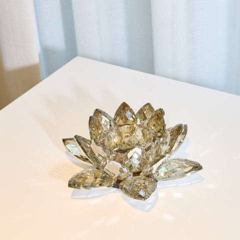
From smaller periwinkle ceramic vases to veri peri throw pillows that add a subtle cool toned charm to your design, there are a million ways to incorporate this stunning shade in your home. If making a huge commitment to this color is not your goal, start small with some fresh purple delphinium or precious matthiola flora from ironyhome.com to get a feel for the hue.
3. Wrap Your Walls in Veri Peri
Let pantones veri peri sing on your walls. Wrapping your walls in a courageous and creative hue, veri peri creates a calming atmosphere and paints a beautiful canvas with other elements of your home's design.
via Benjamin Homes & Gardens (Color of the year)
Teakwood furnishings, vibrant golds, and soft pastels look beautiful against vibrant veri peri walls.
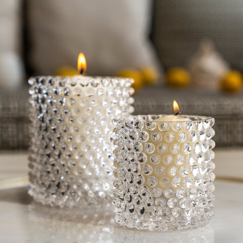
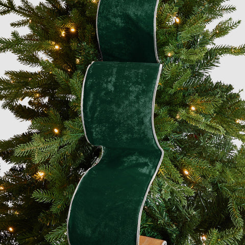
4. Soft, Vibrant Textures
Pantones official launch video for veri peri as the color of the year shows a vibrant, silken-soft, and luxurious texture - opening up the room to a world of new textures to include in your designs. From vibrant velvet statement pieces, to silken veri peri bedsheets, experiment with different textures and let your imagination guide your design.
 Via Irony Home (Color of the year: Veri Peri)
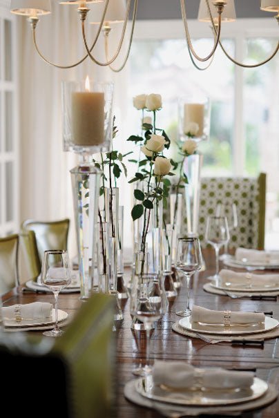
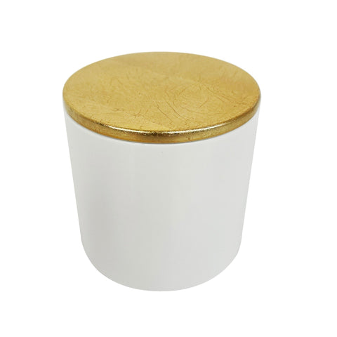
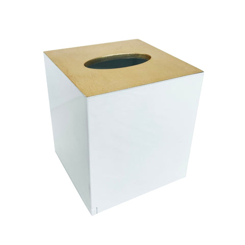
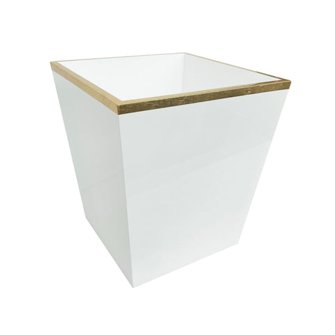
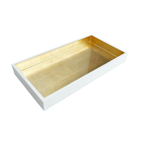
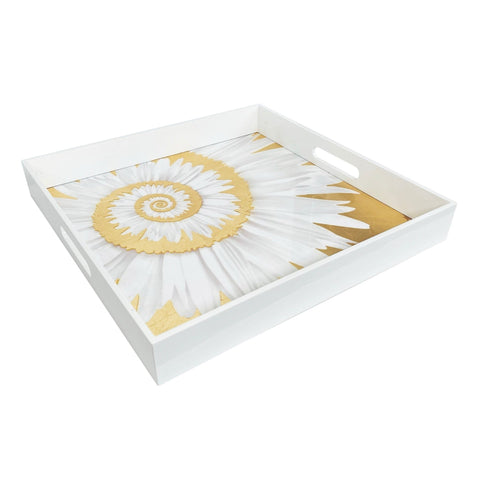
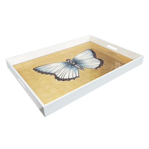
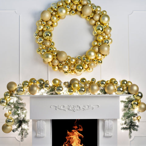
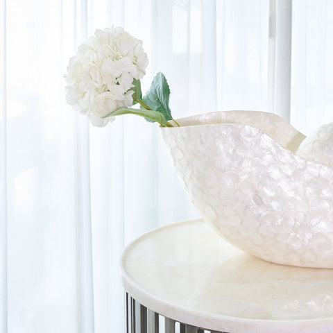
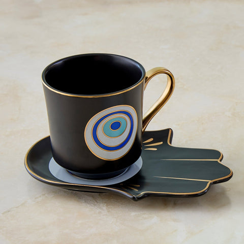
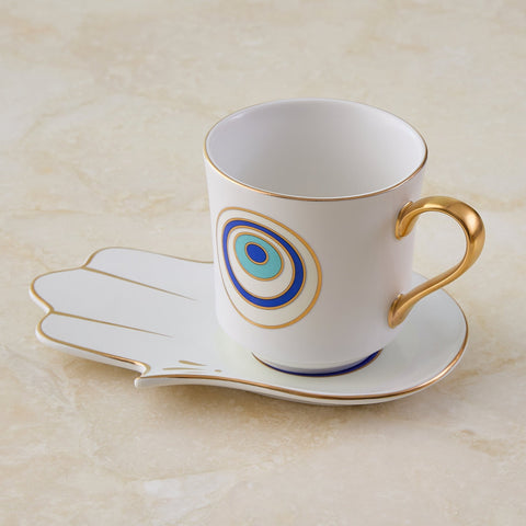
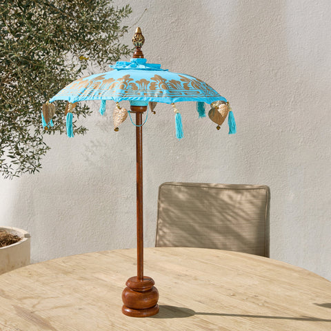
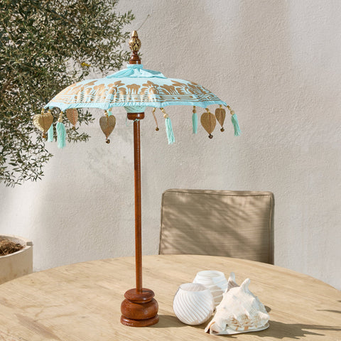
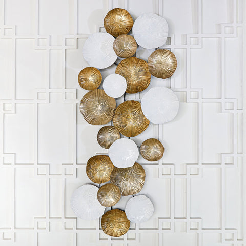
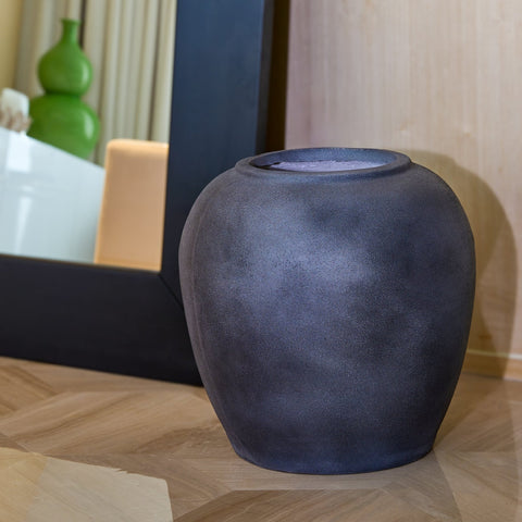
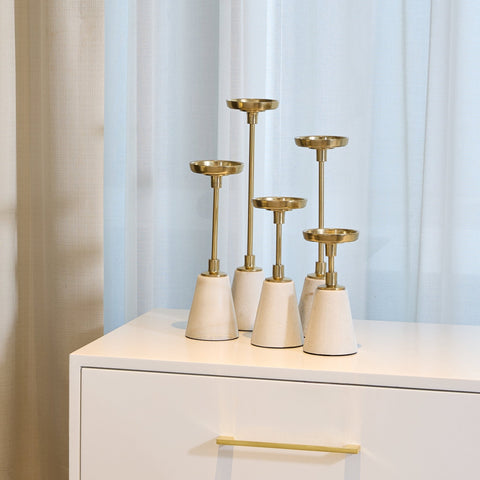
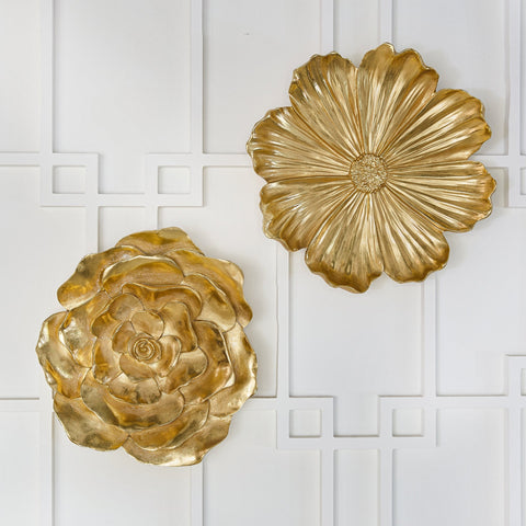
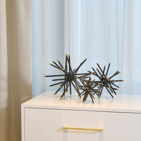
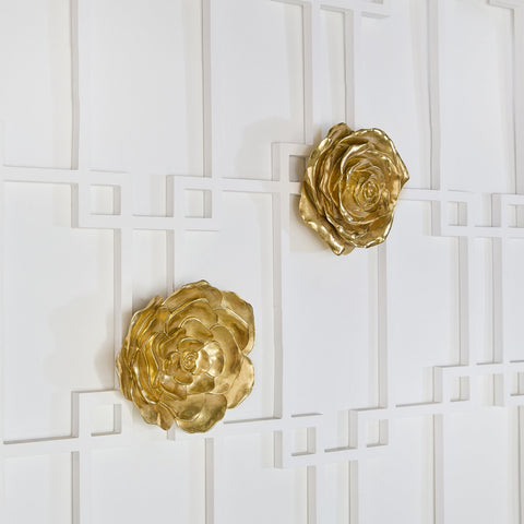
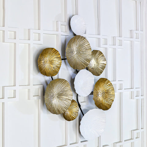
5. Glamorous Golds
Nothing pairs more beautifully with the already versatile veri peri shade more than a luxurious and glamorous gold. Choose furnishings, fixtures, dinner and serve ware, and other décor accessories that have a stunning gold finish and upgrade your home's design with attention to these minor details.

The marvelous warm undertones of classic golden décor complement the cool neutrals of veri peri perfectly, creating a breathtaking home design.
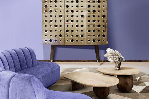
6. Embrace the Veri Peri Spirit
Veri Peri is a spirited hue that adds to the beauty of each design it incorporates; from modern-chic to luxurious classic interiors. The subtle cool undertones of this shade pair beautifully with calming neutral tones, creating a strikingly sophisticated display.

via Pantones color of the year
If you’d like to go all in with veri peri, let it steal the spotlight by pairing it with softer neutral shades. Incorporate it in a luxurious velvet upholstery, veri peri throw pillows, and floor to ceiling drapes.